 |
| Hello, Edwin Hubble. |
 |
| Hello, Hubble Space Telescope. |
 |
| Thanks, Wikipedia. |
If you simply point your telescope at the sky, find a bunch of stars, and plot them on an H-R diagram, the only thing you will know with any certainty is that they're not all the same star. To get useful information from this diagram, you have to be specific about what you're looking at.
For this lab, we were looking at open star clusters, which are groups of stars that all formed from the same giant molecular cloud (real term). If that's true, then you can assume that all of the stars in the cluster are roughly the same age and roughly the same distance away from you. If you plot a cluster on an H-R diagram, a particular feature suddenly pops out: that big diagonal line called the the main sequence.
From astrophysical theories, we know that stars on the main sequence are those that are burning hydrogen in their cores. This is what our star is doing; it's what most stars that we look at are doing. Eventually, as a star gets older, it burns through all of the available hydrogen in its core and moves off of the main sequence (top right-ish) and becomes a giant of some sort, and then much later stops fusing at all and becomes a stellar remnant like a white dwarf (bottom left-ish).
What the existence of something like the main sequence means is that if a star is burning hydrogen in its core, and it's at some particular temperature T, then it will also be at some particular luminosity L. One demands the other. There is a pretty concrete relationship--for a main sequence star--between its mass, temperature, luminosity, and lifetime. Bigger stars burn brighter and hotter, go through their fuel more quickly, and thus leave the main sequence sooner.
But as I said earlier, if you just point your telescope at a bunch of stars, it's hard to know what you're looking at. In fact, the only information you get from a telescope about a star is how bright it is, and brightness is a result of a star's intrinsic luminosity as well as its distance from you. The farther a way a star is, the dimmer it is. Because of that, you don't always know if you are looking at a bright star far away or a dim star close to you. So how are we able to figure out a star's luminosity and temperature?
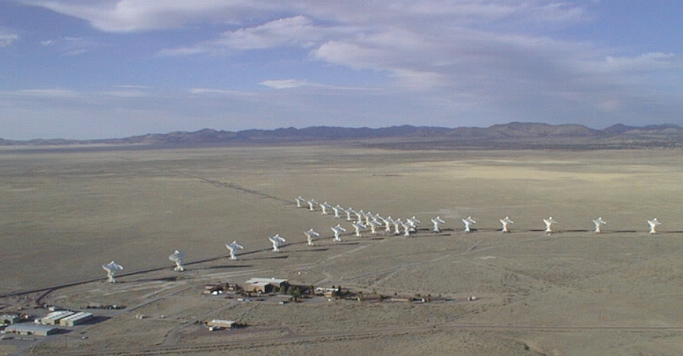
By restricting how we look at the star. Another difference between the popular image of astronomers and the reality is that the telescopes astronomers use today don't just indiscriminately collect all the light that hits them. In fact, some telescopes don't collect visible light at all. Some, like the Arecibo Observatory in Puerto Rico or the Very Large Array in Contact, for example, collect radio waves.
 |
| From APOD. |
If this has an effect just between different colors of visible light, imagine the effect between visible light and radio waves and x-rays, for example. But at the visible light level, this discrepancy between how light behaves at different wavelengths means that you can collect more accurate information about an object if you look at it through filters that only pass specific ranges of wavelengths. This way you can calibrate your machinery just for those wavelengths and not worry about anything else.
There are a lot of filters astronomers use to look at stars. For this lab, we looked at stars through B and V filters, which eye-rollingly stand for blue and visible filters. It's enough to know that the B filter looks at bluer (shorter wavelength) light and the V filter looks at redder (longer wavelength) light. If a star is brighter in the B filter than the V filter, this corresponds to a hotter star. That's because stars roughly follow Wien's law, which says that a blackbody's peak wavelength--the wavelength at which it emits the most light--is inversely proportional to its temperature. So the more light at shorter wavelengths, the higher the temperature.
This observation lets us construct a particular H-R diagram called a Color-Magnitude diagram. For boring and annoying reasons (blame Hipparchus), astronomers measure the brightness of objects with the magnitude system, where smaller values represent brighter objects. For our CMD, the y-axis is the magnitude of light coming through the V filter (so higher on the graph is brighter, which means lower magnitudes). The x-axis, which is supposed to be temperature, is instead the quantity B-V.
Recall, if there's more blue light than red light, the star is hotter. More blue light means a lower B magnitude than V magnitude, which means hot stars will have a low B-V. Since temperature is plotted from hot to cold on the H-R diagram, this means we go from low B-V to high B-V on the x-axis.
So now we are plotting the B and V filter magnitudes of stars in the cluster M41, which we're assuming are all roughly the same age and distance from us. Here's the plot:

Hey, that looks kind of similar to wiki's H-R diagram! There's a clearly visible main sequence starting in the top left and moving down and to the right, and then there's a weird branch in the middle. Those are giants of some variety or another that have turned off of the main sequence. We can predict that this is a relatively young star cluster because it doesn't seem to have much in the way of stellar remnants (stars below the main sequence). What else can this CMD tell us?
For the purposes of the lab, we engaged in a process known as main sequence fitting that lets us figure out the age of and distance to a cluster.
As I mentioned earlier, brighter, hotter stars burn faster than dimmer, cooler stars; they leave the main sequence more quickly. So if all of the stars in a cluster form at roughly the same time, this means young clusters will have a pretty even spread of hot and cool stars, but old clusters will mostly have cool stars, because the hot stars will have stopped burning long ago. On an H-R diagram, this means that the main sequence of a cluster will slowly shrink over time, beginning with the stars in the top left. So where the main sequence ends, called the turn off point, corresponds to the youngest age a cluster could be. If it were any younger, then you would see hotter, shorter-lived stars farther up the main sequence.
This can be taken a step further. Through stellar evolution models (produced by computer simulations), you can plot the absolute magnitudes of various types of stars at a particular age. These models are called isochrones, because they show you a line of stars at a constant age. If you can match the features of your isochrone (such as the turn off point) to the features of your real cluster, you can date the cluster. In our lab, we had isochrones ranging from 100 million years old to 11 billion years old.
So let's date M41. First, let's compare it to the 11 billion year old isochrone (in red).

As you can see, this clearly doesn't fit. It's way farther to the right and way higher up than M41. But let's think about something for a moment. Being way farther to the right means it only has cold stars, which are old stars. We predicted above, because of the lack of stellar remnants, that M41 was probably young, so this makes sense.
By why is the isochrone so much brighter than M41? Here we can be fooled. We are seeing the cluster as bright as our telescopes see it, but the isochrone is a computer model which plots stars as bright as they would be if they were 10 parsecs (about 32.6 lightyears) away. Something seen at 10 pc is said to be seen at "absolute magnitude" for uninteresting historical reasons. If we were to adjust the magnitude of the isochrone, moving it up and down the y-axis, then we would also be adjusting the distance at which we saw it--the farther down the y-axis, the higher the magnitude, the dimmer the isochrone, the farther away it is.
We won't bother with that here, because this isochrone is obviously too old for our cluster. With some fiddling, we can find an isochrone that does fit. Specifically, the 300 million year isochrone.

This looks to have the right shape but is way too bright. So we know that our cluster is farther away than 10 pc. If we adjust the magnitude of our isochrone, we can get a better fit.

This isn't perfect, but the very nice alignment with the main sequence is encouraging. To get this match, we adjusted the magnitude of the isochrone by 9.2, which doesn't mean anything to anybody not steeped in dreadfully tedious astrometrics.
 |
| People steeped in dreadfully tedious astrometrics. |
Looking up M41 on wiki (reliable?), it gives a distance of 710 parsecs and and age of 190 to 240 million years old. Not bad.
We then did the same thing for cluster M67. With many more stellar remnants (bottom-left), it looks like M67 is probably older.

After another round of main sequence fitting, this is our closest match.

An isochrone 3.5 billion years old with a distance modulus of 9.7, corresponding to 870 parsecs. Wiki says M67 is 3.2-5 billion years old and 800-900 parsecs away. Again, not bad. In fact, a better fit.
So that's main sequence fitting, one rung in the cosmic distance ladder (real term) astronomers use to show us how insignificant we are (by demonstrating the vast scale of the universe).
No comments:
Post a Comment